“To me though it embodies the spirit of daring to be different. Not for the sake of it but just to try something new and to push things a bit further.”
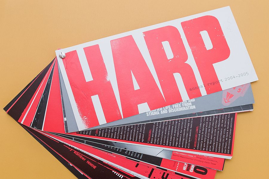
This annual report represents my first experience of working across HARP with colleagues. That’s how annual reports were done – people who were interested got together and worked with the designer (Andrassy Design) to produce a record of the previous year’s activities. The brick, as this one became known, was the result of this work. It was a particularly ambitious design – possibly not entirely practical – it cost too much to post out! However, seeing it again after all these years made me reassess the report – to me it represents ambition to do things differently, to be creative, to use strong images and different ways of displaying information, to be playful and innovative and not afraid of space.
I know that to many this will just be an annual report. So what? To me though it embodies the spirit of daring to be different. Not for the sake of it but just to try something new and to push things a bit further. We didn’t do it again – it really was too impractical but the reports that came next were probably even better and continued to challenge the standard annual report format. I love this report and it was a great welcome to working for HARP. I felt I was with an organisation that wasn’t afraid to look at alternatives, that involved people and ultimately wasn’t afraid to get things wrong.


