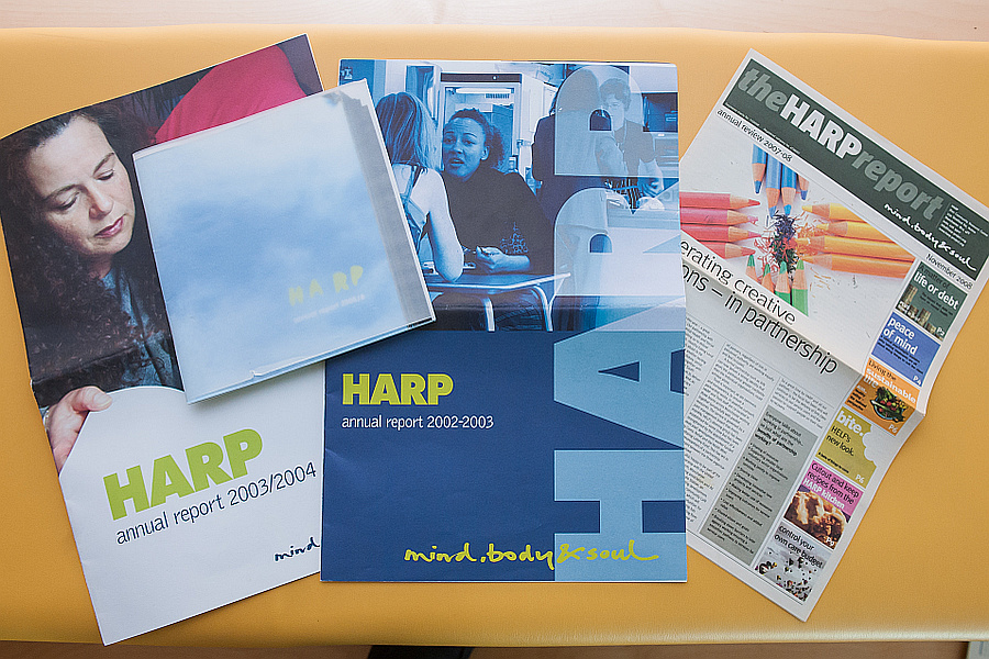
Annual Reports 2003/4, 2004/5, 2005/6 and 2007/8
That time of year again? Need to do the annual report – groan. Reporting on the previous year should and often is a great opportunity to reflect and celebrate successes or reassess after a particularly challenging year. HARP, though liked to do things differently in this respect and here is a selection of reports from the ‘golden years’. Strong images, good design, and with the newspaper an ambition to shift things again to enable greater content.
These reports really show that HARP understood the value of design and the importance of presenting information in different ways. The 2005/6 report uses really strong and unusual imagery and different types of paper, there is humour and quirkiness – the adverts in the newspaper and the agony aunt page used as a different way of presenting case studies. The two big reports used size and typography and different perspectives as their focus.They also mark the changes in the environment. The period of bigger and brasher annual reports represented the period of great growth in the charity with Assertive Outreach and YASP.
What followed was the crash of 2008 and a period of cuts to funding and therefore cuts in budgets, so annual reports went online. The affiliation to Mind in 2011 also led to needing to align with brand, which inevitably meant less flights of fancy with design.


